Parappa the Rapper Cover Arts
Parappa the Rapper is a video game about a dog named Parappa who solves his problems through rapping, whether it's about him learning karate, getting his drivers license, or going to the bathroom. It's known for being the first rhythm game and for it's weird and unique visual style that makes the characters look like they came from a pop-up book, so I figured why not give my thoughts on the covers that released in some regions? I'll only cover the ones from the PlayStation 1 since future ports just use the original ones.
This is the original cover released in Japan. We see Parappa and his friends having a good time alongside PJ DJing. The bosses are in the background (except for King Kong Mushi who's at the bottom left) crossing their arms in disapproval and Joe Chin in the background riding his cool car. I like this one as it reminds me of a children's story book with all of the characters and bright colors. I didn't notice it until writing this, but there's a flying toilet in the background above the logo. It just shows you how weird the world of Parappa is.
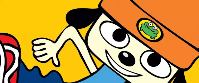
This is the one that released in North America with Parappa smiling on a yellow background and the logo color being changed to neon green instead of the multicolor one from the Japanese release. Despite how simple it looks, I kind of like it. The yellow background makes me curious if it was inspired by the album "3 Feet High and Rising" by De La Soul?
Finally, we have the PAL release. It's similar to the NA one with just Parappa in it except the background is orange and they added the subtitle "The Hip-Hop Hero". I'm not really a fan of this one, which might be weird since I liked the NA one for its simplicity. The reason why I don't like this one that much is because they reused the art of Parappa from the Japanese version and I don't really like orange background. This cover art reminds me of the crappy Mega Man X ones that released in Europe, except the art of Parappa looks good.
Overall, I prefer the Japanese version since I love how weird and colorful it looks. I wish the other regions kept the Japanese one in future re-releases but I guess the NA one is iconic to fans over there. Which one do you prefer? Do you like the colorful JP one or do you like the simple covers released in NA and PAL regions? I'd love to know.


It's weird, the PAL version takes the Japanese art and takes away the shading. That, and the eyes aren't doing it for me. And maybe the colors are too desaturated in the PAL cover too, since the Japanese box has all this color and stuff going on.
ReplyDeleteIt's very strange. I wonder if this cover was rushed?
Delete